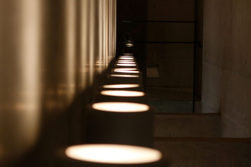
PANTONE 17-1230 Mocha Mousse is undeniably one of the most delicious colours ever named as the Pantone Colour of the Year. With its warm, rich, coffee hue, it instantly evokes feelings of comfort and sophistication. Now, imagine incorporating it into your event colour scheme. From lighting to mousse desserts, this is only the tip of the iceberg. With plenty of ideas, your event can also radiate harmony and contentment.
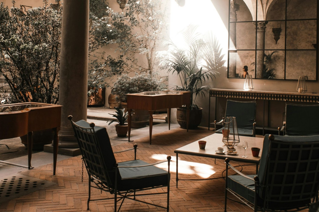
Unfortunately, not everyone agrees that Mocha Mousse is the right colour for events. Some argue that it is a muddy shade that symbolizes nothing but dirt — they are wrong. With such a universal shade that exudes elegance, there is so much you can do with it. The possibilities are endless, starting with desserts like tiramisu, chocolate cakes, puddings, or anything brown. You can even draw inspiration from a coffee shop vibe, with its inviting and cozy atmosphere. In fact, you could create an entire event theme based on a desert-inspired aesthetic, influenced by the Dune movie. All you need is a little imagination!
If you are still skeptical, for example, for corporate events, use the colour as a neutral so your brand can stand out; by using it as a backdrop and as a neutral palette for décor and settings.
A Touch of Gold: Elevate Your Event to Luxe Status
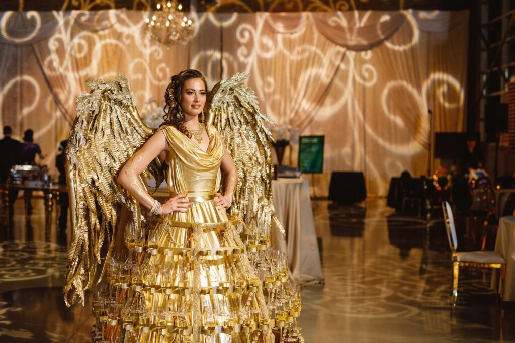
Mocha Mousse also goes well with any metals, so be sure to include some gold metallics to give depth and shine to your event, making it much fancier. But most importantly, consider your audience. If most of them love the style of ‘old money,’ believe me, they would love to attend a venue featuring that colour palette. Very timeless.
Mood Magic: How Mocha Mousse Sets the Tone
Aside from the aesthetic appeal of the colour Mocha Mousse, this light brownish shade can, in fact, affect your guests’ moods. Colour theory is real, and just as people tend to prefer red-coloured foods over blue, this colour carries its own significance. Being a shade of brown, it symbolizes grounding, earth, and roots, which can be translated to stability, reliability, and a sense of security. These are the elements you want and need to elevate your brand to a different level.
For more, I would recommend checking out the Pantone-suggested palettes incorporating the colour of the year: Relaxed Elegance for that luxurious experience, or Floral Pathways for a tropical, floral vibe for some sense of direction. And for further discussion or to explore potential collaboration, feel free to get in touch.

