Choosing the 2021 PANTONE Color of the Year
Each year Pantone releases their PANTONE color of the year. The Pantone color of the year selection process requires thoughtful consideration and trend analysis. To arrive at the selection each year, Pantone’s color experts at Pantone Color Institute comb the world looking for new color influences. This can include the entertainment industry and films in production, events, traveling art collections and new artists, fashion, all areas of design, popular travel destinations, as well as new lifestyles, playstyles, and socio-economic conditions. Influences may also stem from new technologies, materials, textures, and effects that impact color, relevant social media platforms and even upcoming sporting events that capture worldwide attention.
Announcing The 2021 Colors
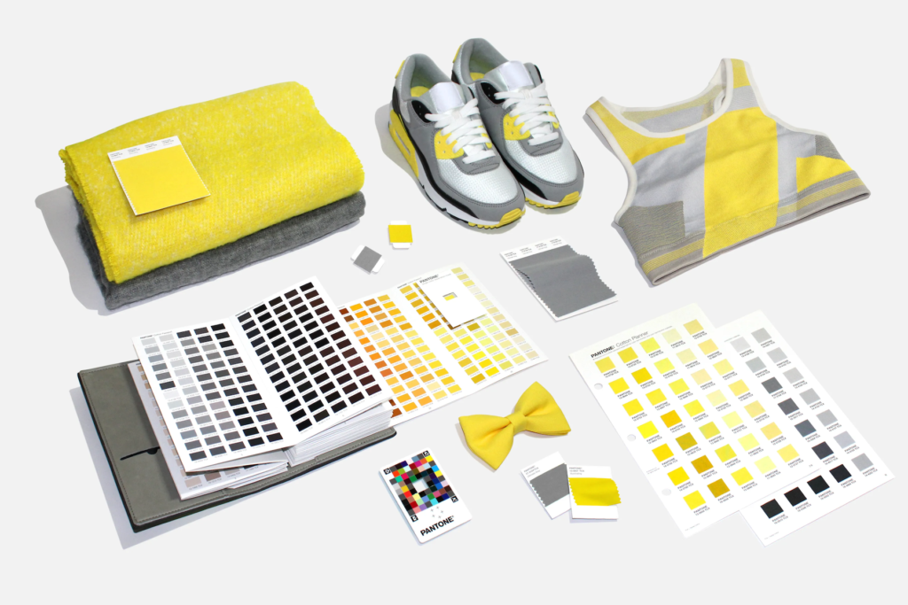
As Event Producers, we anxiously await this announcement, as we visualize our next award winning event design masterpiece! In 2021, PANTONE didn’t disappoint. Earlier this month, Pantone announced its Colors of the Year for 2021: Pantone 17-5104, Ultimate Gray, and Pantone 13-0647, Illuminating (a bright and cheerful yellow). The Institute said that the pair represents two independent colors that highlight how different elements come together to support one another. And after the year we had in 2020, we strongly support these PANTONE Colors of the Year.
Practical and rock solid but at the same time warming and optimistic, the union of PANTONE 17-5104 Ultimate Gray + PANTONE 13-0647 Illuminating is one of strength and positivity. It is a story of color that encapsulates deeper feelings of thoughtfulness with the promise of something sunny and friendly. Two colors does not represent indecisiveness, but a metaphor. Get ready for Ultimate Gray and Illuminating. Or, in normal-speak: the light at the end of the tunnel. The union of an enduring Ultimate Gray with the vibrant yellow Illuminating expresses a message of positivity supported by fortitude. The combination is aspirational and gives us hope. We need to feel that everything is going to get brighter – this is essential to the human spirit and the need to feel connected.
Supporting Each Other
This is only the second time in the 22 years that Pantone has been choosing a color of the year, that two colors have been selected. The first time was in 2015, when Rose Quartz and Serenity were chosen (which is to say, pink and blue for 2016). That year, the two shades were meant to blend into each other, reflecting the recognition of gender fluidity and social progress. But this year, the two shades are meant to stand on their own, as complementary tones, supporting each other.
“No one color could get across the meaning of the moment,” Laurie Pressman, the vice president of the Pantone Color Institute, said on a call. “We all realized we cannot do this alone. We all have a deeper understanding of how we need each other and emotional support and hope.”
Energy, Clarity and Hope
As people look for ways to strengthen themselves with energy, clarity, and hope to overcome the continuing uncertainty, spirited and emboldening shades satisfy our quest for vitality. PANTONE 13-0647 Illuminating is a bright and cheerful yellow sparkling with vivacity, a warming yellow shade imbued with solar power. PANTONE 17-5104 Ultimate Gray is emblematic of solid and dependable elements which are everlasting and provide a firm foundation. The colors of pebbles on the beach and natural elements whose weathered appearance highlights an ability to stand the test of time, Ultimate Gray quietly assures, encouraging feelings of composure, steadiness and resilience.
Emboldening the spirit, the pairing of PANTONE 17-5104 Ultimate Gray + PANTONE 13-0647 Illuminating highlights our innate need to be seen, to be visible, to be recognized, to have our voices heard. A combination of color whose ties to insight, innovation and intuition, and respect for wisdom, experience, and intelligence inspires regeneration, pressing us forward toward new ways of thinking and concepts in our events.
Incorporating Color Into Your Event
For over 20 years, Pantone’s Color of the Year has influenced our event industry, product development and purchasing decisions in multiple industries, including fashion, home furnishings, and industrial design, as well as product packaging and graphic design.
From gray seating options to a yellow “red” carpet, there are many inspiring ways to incorporate Pantone’s 2021 Colors of the Year into your future events in the year ahead, even if it is virtually. One person’s dependable is another person’s depressing, however, which is where Illuminating comes in. It’s not the egg yolk-like yellow of Mimosa, the color of the year of 2009, nor an acidic or highlighter yellow, nor the “go into the light” yellow of the afterlife, or sci-fi adventure, but more of a sunshine, or smiley face, yellow. It’s about our minds resetting to what’s really important.
The Future is Bright
Pantone also released Facebook and Instagram augmented-reality filters, so folks can easily bring Illuminating and Ultimate Gray into their event spaces. Plus, Pantone collaborated with ARTECHOUSE in New York to produce the announcement’s social media reveal, and will debut an AR experience inspired by the colors at the venue in 2021.
The news of the coronavirus vaccine has strongly reinforced Pantone’s selection. Even in the gray sameness of our current days, the future does look a whole lot brighter. Illuminated, even. It’s all about the messaging so get ready for a brighter future!
~~~
You might enjoy reading the following blogs:

