Case Study in Gratitude: [the quality of being thankful; readiness to show appreciation for and to return kindness]
Event: 1920’s Soiree
Objective: To transform a plain brick and metal building into an elegant upscale environment
Result: Grateful for a multi-award winning décor event with rave reviews from the guests
OVERVIEW
The 1920’s Soiree event was one of our most challenging events we have produced. Our client had difficulty settling on the exact particulars of the theme they wanted. Then layoffs within the company necessitated a 20% budget reduction one month before the event.
Despite these obstacles, the 1920’s Soiree Holiday Staff Event still delivered the luxurious touches we had originally planned. We were filled with gratitude. Through strategic decisions about the décor and creative measures to address budget cuts, we created a colourful and elegant tableau for guests to enjoy a sophisticated and entertaining event.
EVENT OBJECTIVES
Objective #1 – Transform a plain brick and metal building into an elegant upscale environment
Our chosen venue, the Rocky Mountaineer Railway Station, is a building with very little decoration. This can be helpful or a hindrance.
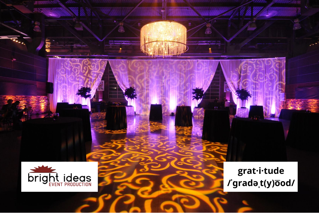
We used the plain space as a blank canvas, utilizing carefully placed décor and lighting effects to transform the interior, creating an atmosphere of luxury and elegance through velvet draping, chandeliers, carefully chosen décor items, and extensive use of patterned gobo lighting. The result was an environment reflecting our theme of Roaring Twenties luxury.
Objective #2 – Maintain look and feel of the event despite a last-minute budget reduction
Layoffs within the company as the event approached created a perception problem for our client. It was felt that too lavish a budget could be interpreted as disrespectful to those who had lost their jobs, so the budget was cut by 20% four weeks before the event.
We reviewed our décor list and realized the best tactic was to eliminate a big-ticket item, three custom-designed lounge areas complete with furniture, draping and lighting. We then rearranged other décor and seating elements to help fill the space. Effective damask gobo lighting projected onto the floor and walls filled an otherwise empty area of the venue. We were so grateful for our lighting company.
Objective #3 – Give each section of the space a distinct identity within overall theme
Our client had trouble deciding on the theme they wanted for the event. Three options were presented, OK’ed, and then rejected. To address this issue, we combined elements of all three of the original proposals, delivering the impression of a 1920s casino with modern touches, while still maintaining three different settings within the overall theme.
With this approach we were able to exceed the client’s theme and décor expectations without having to abandon the pre-production work done on the project. Not losing our previous work was also something we were grateful for.
EVENT DESCRIPTION
The décor requirements for the 1920’s Soiree went through a series of changes prior to the event, but the result was a roaring success despite these challenges. Even a 20% budget reduction just one month before the event was handled with a creative approach, resulting in a final product where guests would never have guessed a big part of the original layout was missing. One of our goals was to create three distinct areas within the venue, while maintaining the overall ‘look’ of the theme. By featuring different décor elements, but carrying important aspects such as colour scheme and materials through each area, we achieved this outcome with gratitude.
Registration
As with all themed events, first impressions are important. Guests arriving at the 1920’s Soiree were greeted by a 25 foot red carpet entrance and a customized archway in gold and black, with the company name emblazoned in gold and black on a 12 foot wide sign, and flanked by black drape for added elegance.
The registration area featured gold silk linens, white ostrich feathers, and feather boas in gold ice buckets on stands. Vases with black ostrich feathers in vases with water pearls and gold hoop provided contrast. Two small sitting areas offered guests a quiet area to relax or make phone calls. These were decorated with ornate antique gold chairs, each with a small table draped in black with gold centerpieces.
Black and gold was the featured colour scheme throughout this part of the venue. From the registration desk, guests moved to the coat check area, where the décor featured brass lamps which were artfully shaded with black feather boas, gold tulip lamps, and event branding in gold antique style frames, along with brass accents such as a solid brass tiger figurine. The effect was one of retro elegance, capturing the ambience of a luxurious 1920s casino. With coats checked and registration package in hand, our guests were ready to check out the rest of the venue!
Grand Entrance
Passing through the grand entrance arch guests stepped into the dance and lounge area. Flanked by a jazz band on one side and the DJ booth on the other, this part of the venue continued the décor and colour scheme, with the addition of mauve and gold lighting effects. Damask gobos dappled both the floor and the room draping, cocktail tables dressed in black with gold metal tea lights offered areas for socializing, and black ostrich feather vignettes in tall gold sparkle vases continued our theme of 1920s elegance. A stunning 5 foot diameter crystal chandelier gave the room its focal point.
This section was one of the most challenging to design. It had taken the biggest hit from the budget reduction, with the loss of three lounge vignettes and large décor pieces. We had to find a creative way to fill the space. First we covered the floor and drape with the gold/amber damask gobos to act as a textured decoration. Next, we moved some tall tables from the casino areas to the dance area to fill the space and offer areas for conversation that had been lost when the lounges were dropped from our plans. Then we projected amber light onto the walls to give it depth and fill the room with warmth and color.
To help fill the room we also set the DJ booth ten feet out from the wall, so that the mauve Plexiglas booth acted as a décor focal point for that side of the room.
Adult Playground
The third section of the venue was the biggest, containing two casino areas, three side-by-side bar stations, and the food stations. We knew our guests were enthusiastic gamblers, so a wide variety of the casino games were offered. The activities requiring greater concentration, such as poker and blackjack were set back from the busy food stations, where mingling could distract. The more animated games such as roulette and craps were set up at the back of the room.
In the middle of this section of the venue were four food stations with 360 degree access. Above them were four crystal chandeliers. This was another of our challenges to overcome. To save on our budget, the chandeliers had been left in place from an event the week earlier. As the room layout changed due to budget cuts, it became apparent they wouldn’t be in the right place (above the food stations). They were quickly struck so we could bring in scissor lifts to re-position the chandeliers. All this happened just hours before the doors were to open, but thanks to quick and decisive action, it did not impact the actual event.
Event Decor
Décor in the casino area featured a variety of elements found in the other rooms, such as gobo lighting effects, mauve accents, and decorative touches such as food menus in antique style gold frames, small gold lamps on the cocktail tables, and gold accents such as vases and tea lights.
Mounted on walls around the room were giant (6’ tall) playing cards, while at the casino prize table, oversized dice continued our gambling motif for this area. Gold wrapping paper and red bows gave a nod to the holiday season.
At both ends of the prize table large-scale vases encrusted with glass jewels framed the prizes. Above, a flashing, illuminated ‘Casino’ sign made this area easy to find even once the room filled with guests.
Conclusion
Large events such as the 1920s Soiree always present challenges. However, using our experience, creativity, and resourcefulness, solutions were found for every roadblock. Even the need to adjust our planning in the hours before our event proved to be challenge we could overcome through immediate and decisive action.
Great event décor starts in the planner’s mind’s eye. But it is only an idea. Turning concept into reality when the situation demands flexibility and creativity is the mark of event excellence. We feel the 1920’s Soiree decor showcases those qualities.
Event Documentation
Photos: https://brightideasevents.com/project/1920s-soiree/
Blog: https://brightideasevents.com/news/bright-ideas-blog/part-8-of-10-gratitude-1920s-soiree/


